The hail drifts outside the museum yesterday may say otherwise, but spring is here, and last Thursday marked the vernal equinox, its official start.
It’s traditional at this time of year for newspapers to mark the warming of the weather with photographs of people enjoying the sunshine, spring flowers in bloom and perhaps even gambolling lambs.

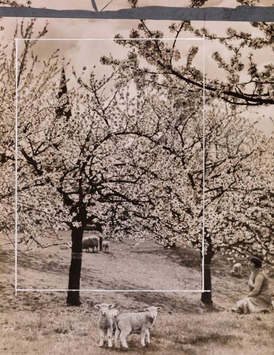
This photograph of an orchard in Sittingbourne, Kent, taken for the Daily Herald newspaper on 6 May 1931, is a perfect spring scene with all the vital elements: sun shining through blossom-laden trees and spring lambs posing for the camera at the front of the picture.
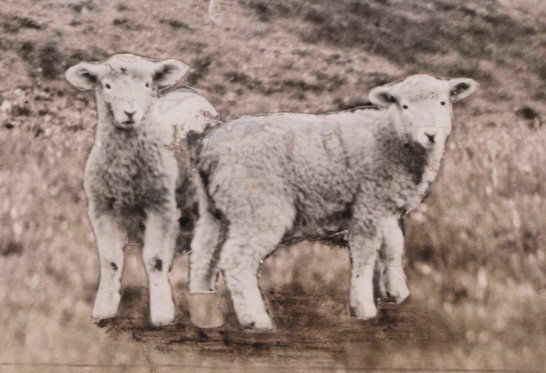
If the lambs look a little odd, that’s because they weren’t really there.

The newspaper’s staff have overcome the reluctance of the field’s lambs to position themselves photogenically, by cutting out lambs from another photograph and sticking them on in the desired spot. They have even had some artful shadows added beneath them. At some point since, the right hand lamb has lost one of its back feet, making the effect even stranger.
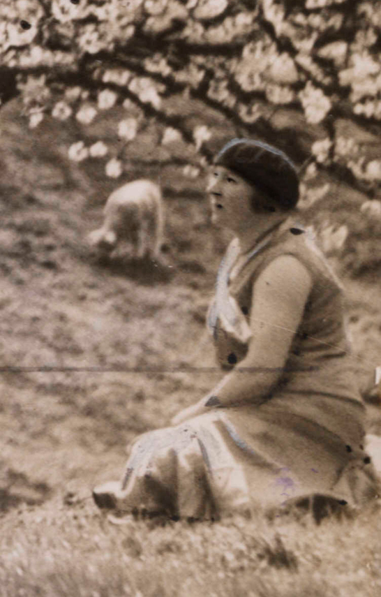
This photograph also shows two of the more common forms of manipulation to create the image the paper wanted to publish: the seated woman enjoying the spring day has had her facial features emphasised in dark pen and a white line drawn around the top edge of her hat, picking it out from the trees behind—standard practices to overcome the inability of newspaper printing at the time to show subtleties of shading.

The striking white rectangle across the photograph shows that the image was used by the paper a second time, more conventionally, if less entertainingly, by cropping it down to make the lamb and sheep in the middle ground the focus of the picture.
… and people get their knickers in a twist when photographers use photoshop nowadays. (tut! ;))
:)