On the night of 2 December 1953, the Games family gathered around my grandparents’ small black and white television set. Uncle Marcus, a radio and television engineer, had set up a spare TV in case of a breakdown. The ‘box’ took time to warm up and had to be thumped into action before the only channel magically materialized. It was to be a historic but tense night for my 39-year-old father, Abram.
Earlier that year, the BBC had asked the Council of Industrial Design to recommend a few designers from their record of 2,300 names. They were holding a competition to design a symbol for television. Abram was one of those nominated and a few selected BBC employees were also invited to participate.
During WW2, he had created 100 posters for Army use which earned him the title ‘Official War Poster Artist’. Although he had won the Festival of Britain emblem competition in 1948, my father was not yet versed in symbol design. But he was always up to a challenge—the more difficult the better. “A difficulty is an opportunity, and an opportunity is a challenge,” he would say with a grin.
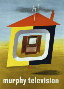
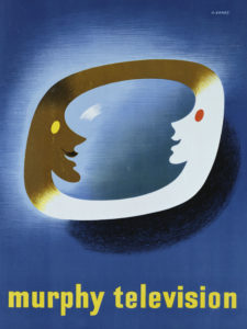
Before starting on any design, autodidact Abram would carry out intensive research into the subject. Now he had to get acquainted with the technicalities of television. In 1949 and 1950, he had designed two posters advertising Murphy Televisions. But he was suspicious of, and had no patience with, the ‘time-wasting’ machine which was beginning to invade the country’s living rooms. He preferred the radio as he could work while listening. It took many years deflecting his children’s nagging before he would allow a television to take root in our home. Even then, I don’t recall my father ever sitting in front of it.
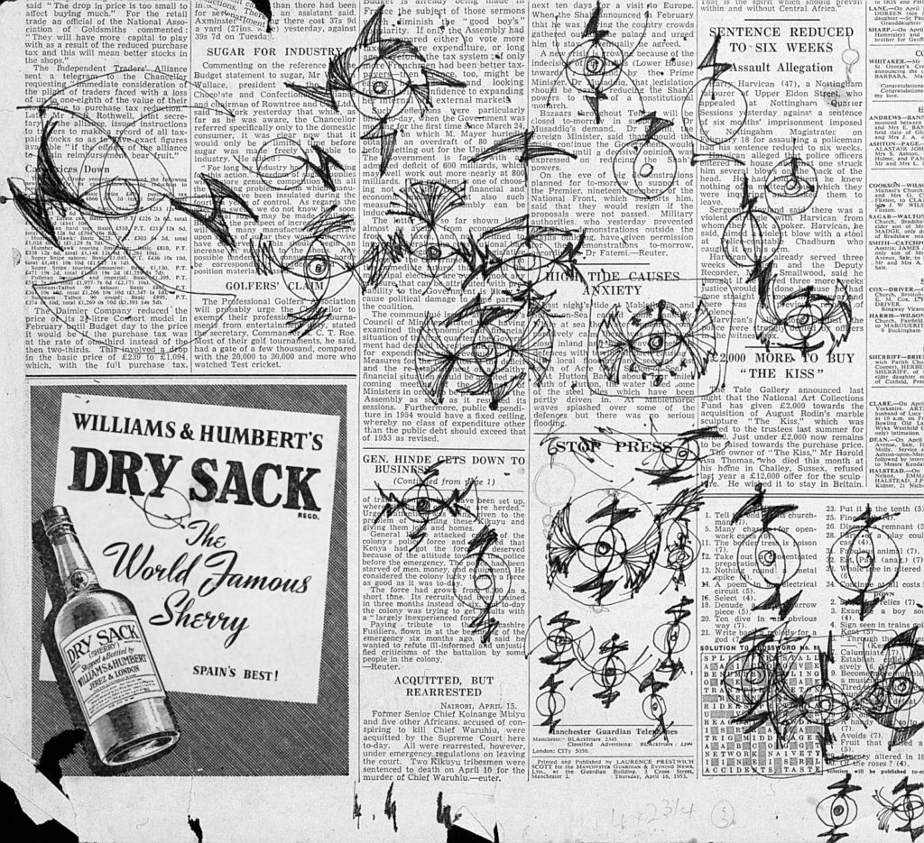
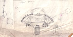
To begin his design, he composed a rudimentary test chart of various pencil lines of different thicknesses, curves, tones, patterns and arcs, and pinned it in front of a television camera in Lime Grove studios. While it rotated, he analysed the sheet of paper on screen and noted the interference to the marks and the effect on their quality. He soon realised the safest image to use would be a circle or arc. On the bus home, Abram scribbled his thoughts onto the pages of a discarded newspaper with his fountain pen. He never learnt to drive so he always travelled by public transport—the perfect place to think. Never one to be idle, he aimed to produce six ideas on scraps of paper before the end of every journey so his time would not be wasted.
Although best known as a poster designer, Abram designed book covers, stamps and advertisements. With all his commissions he applied his personal axiom: ‘Maximum meaning, minimum means’. Simplicity and precise communication were the key to all his work.
“A poster is a boiling down; it’s like peeling the skin off an onion, you go on peeling it off and you get a different quality each time. So it is with design. You reject, you pare away until you get to the essential. If ideas don’t work an inch high, they will never work.” was his adage. This had to apply to the BBC symbol, as the picture on domestic televisions was low definition.
Abram was conscious that the design would have to be instantly recognisable and cover the full gamut of programmes. Because television was a growing medium, Abram ensured his symbol would be progressive and forward-looking, like television itself. Most importantly, the design would be modern and not date.
The technical side of the design would be a challenge, too. It had to express that television was “a changing picture of interest and impressions” and his symbol should express this. As the design had to accommodate a possible moiré effect, which might appear on screen due to lines and dots superimposed on one another, constant experiment with thickness of lines and contours was imperative.
While Abram was contemplating the BBC symbol, he had been commissioned to redesign the exterior of Raymond Loewy’s Gestetner machine, so a metal turning lathe was installed in our living room, much to my mother’s consternation. As well as being a ‘graphic thinker’, he proudly called himself an inventor and a design engineer. Forever curious, Abram deconstructed the duplicator and redesigned its mechanisms. It was this process that inspired him to create a revolutionary three-dimensional, moving symbol for the BBC. After all, television was about movement, so it had to be animated.
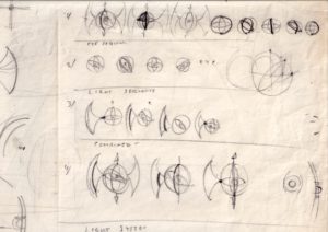
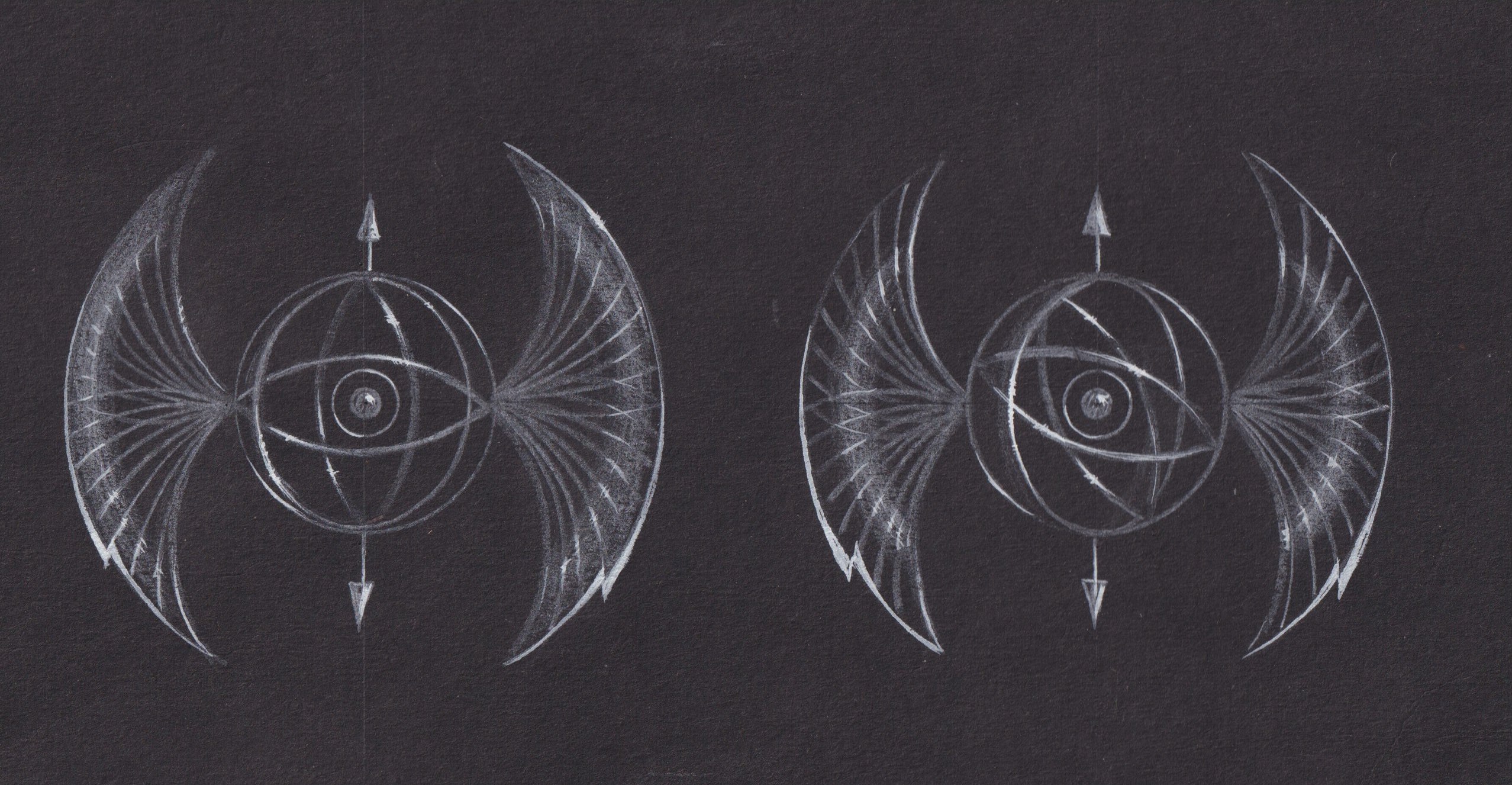
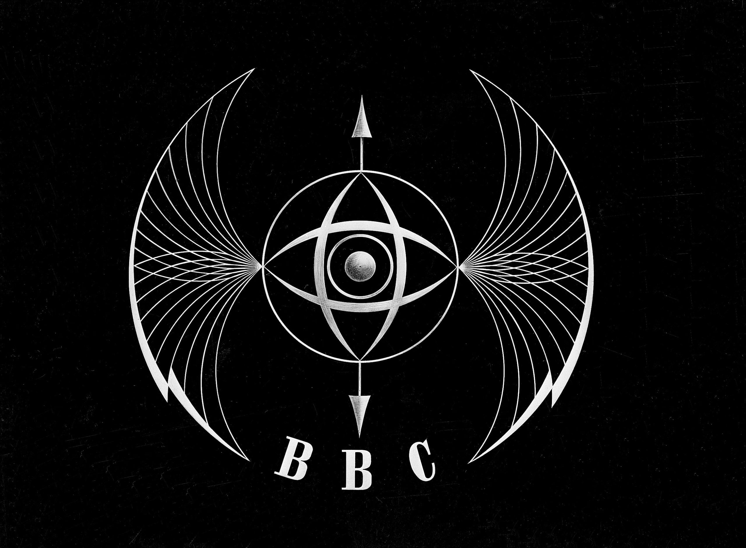
With the instrument case of two riveted metal pencil boxes—made when he was 18—in front of him, Abram began work on his submission sketches. He used compasses, dividers and ruling pens filled with Indian ink with great mastery. He concluded the circle or sphere would represent the globe, and an eye would signify vision, but it had to be in three dimensions. Flashes of lightning, or wings, on either side of the circle were drawn to represent electrical impulses, and forces and arcs were added. A vertical line topped by arrow points stabilised the whole design. To aid the illusion of movement and time, an arc of light was incorporated, starting from the outer wings and moving inwards towards the revolving eye.
Within a couple of months, Abram submitted his design, not expecting success. To his surprise he won the competition. Clive Rawes, the BBC Television Presentation Producer, offered 200 guineas for the design and execution, and a further 70 guineas for the design of an accompanying clock. Although Abram was disappointed he was not paid more, he recognised the commission would bring prestige.
Now the challenge really began. Abram had met model-maker JF Johnson while teaching at the Royal College of Art. In a workshop at the bottom of Johnson’s garden, it took only a few weeks to transcribe Abram’s sketches into a stunning prototype. The delicate 18-inch brass structure was painted grey and suspended from a wooden frame with piano wire and a motor was attached. The lightning effect was achieved by using slotted drums revolving around lamps on either side of the model. Light beams were projected onto the wings. Although Johnson complained the project gave him many a headache, my father was grateful for his patience, expertise and good humour.
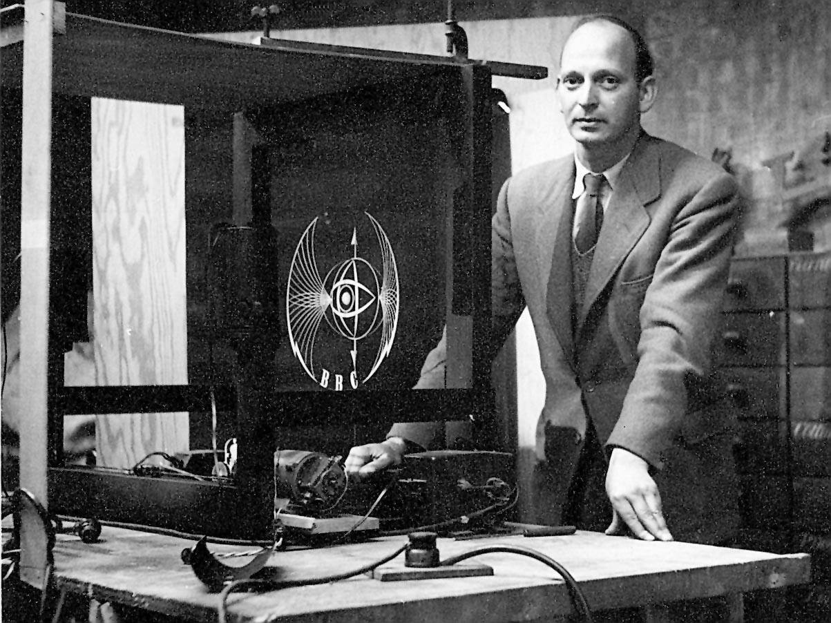
After numerous abortive trials, the ‘Thing’ was filmed in slow motion by the BBC film unit. It was only possible to run the model for a short period due to excessive heat from the lamps. As soon as one successful rotation was filmed, the contraption collapsed. But the film was in the can!
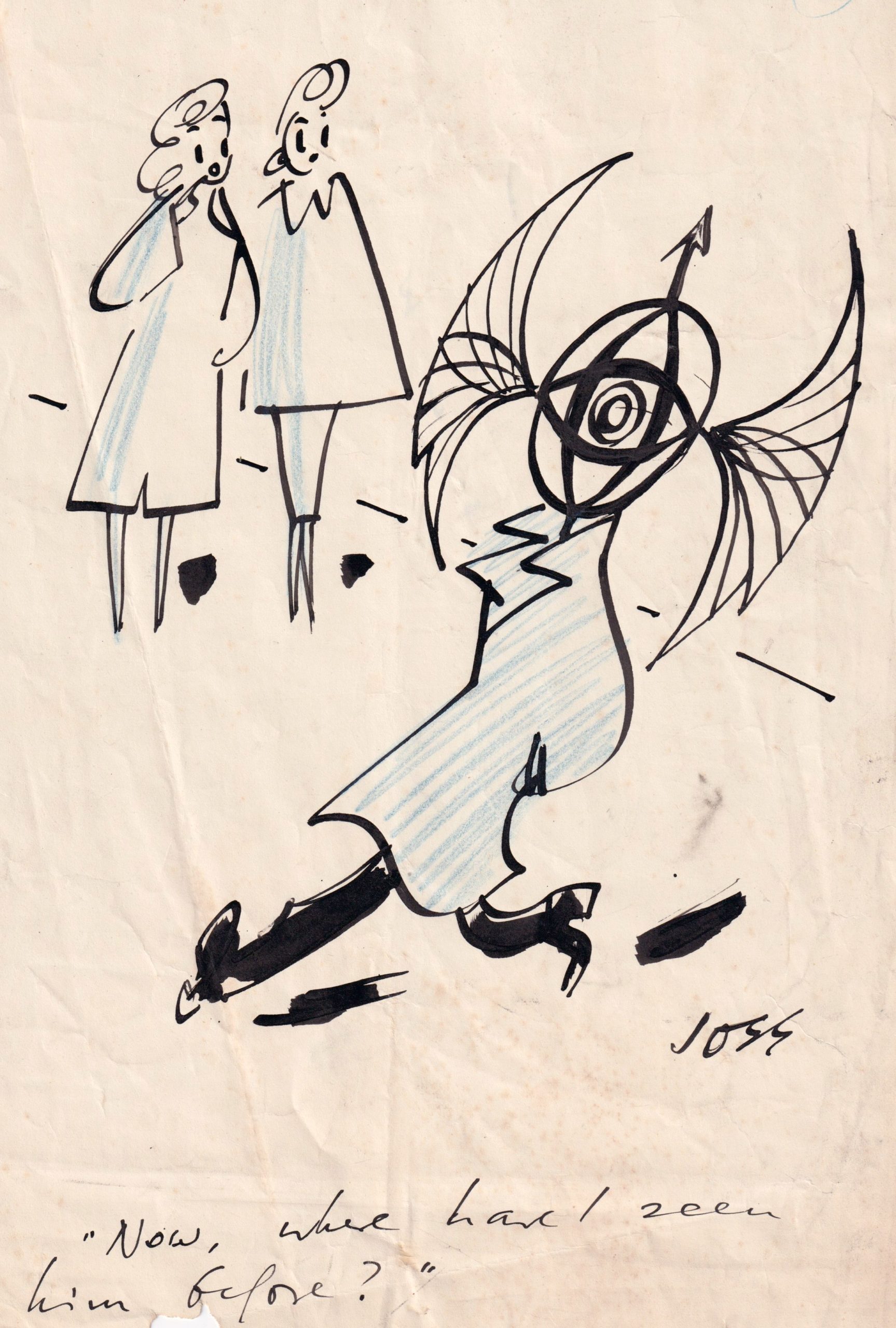
When Abram saw his symbol that December night on his parents’ television, he still feared it would break down. It was accompanied by gentle harp music played by Sidonie Goossens and appeared after the weather report. The following day the press and the public’s fierce reaction astounded Abram, even though he was used to controversy. However, cartoons of the symbol by David Low, Joss and Gus delighted him. Abram admitted his design was a bit frightening but hoped the viewers would get used to it. This was the first time a television symbol, now called an ident, had been animated.
He remembered that earlier in the year the viewers had been traumatised when they saw the original sci-fi serial The Quatermass Experiment. One viewer of the new symbol asked the papers, ‘Is the BBC trying to hypnotise us?’ The indignant public named the design, ‘the ruddy cross-eyed wonder’, ‘the Batwings’, ‘the Thing’ and ‘the Staring Eye’. One newspaper mentioned the symbol would be printed onto wallpaper, though this has never been traced. Another paper ran a competition with a £5 prize for readers who could design a better emblem. They couldn’t!
A letter from AE Macnair appeared in the News Chronicle, ‘Dear Sir, my first sight of the BBC’s new TV symbol caused such a disagreeable emotional reaction that I wrote down and analysed the ideas it suggested to my mind: Menace, darkness, Germans, spiked helmet, bird of prey, baleful eye, cage, torture, bandaged head, nets, whips, thongs, Arial bombs, attacks, pincer movements, Fascist flashes.’
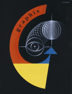
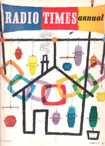
The viewers did get used to the ident—it lasted eight years. In 1955, Abram designed static test cards, which would pop up between programmes, a test tuning signal, clock and regional variants for BBC West, BBC RTF and BBC Scotland. The ‘Roving-eye’ had been designed to be adapted for colour television and in 1955-6 it appeared on a test card used for colour trialling. Curiously, in 1953, he designed a cover for Graphis magazine, which evoked his BBC symbol. Two years later he designed the cover for the Radio Times Annual, followed by a new masthead and grid for the Radio Times in 1960.
My father’s remarkable career lasted six decades. He said of his work, “I wind the spring and the public, on looking at the poster, will have that spring released in its mind.” The same applies to his ‘Ruddy Cross-eyed Wonder’.
Brilliant!
I had first met Abram Games when he was a guest at my parents small hotel in Cliftonville, Margate. He had just designed the iconic symbol for the 1951 Festival of Britain. Learning of my interest in design he encouraged me to go to art school.
In 1955 the year his BBC symbol was first aired he visited Canterbury College of Art as a lecturer, where as a student his words and images became my lifelong philosophy in design.
Abram thus became my mentor, today I cherish his numerous airmail letters of encouragement that he had sent me over the years.
Some years later I was invited to give a lecture at my former art college, where one of the students was Martin Lambie-Nairne who later became the designer of the current BBC logo, plus the designer of numerous others including Channel 4’s, thus becoming Abram Games heir apparent in that field.
In his 1957 book “Brand Identity for Television” Martin wrote: “Arnold Schwartzman came and gave a lecture on the role of graphic designers in television. He brought with him a roller-caption used on Ready, Steady, Go!, Rediffusion’s groundbreaking pop-music programme… I was deeply impressed; so glamorous was the image, that I felt the urge to step forward and touch that roller-caption”.
They say what goes around, comes around!